Almost everyday, your prospective customers are searching online for services/products you offer. With 1.5 billion active websites, it is difficult for anyone to stand out. If you want to stay on-trend and engage website visitors, it’s crucial to pay attention to web design trends. A great website design can help your brand stand out from the competition.
In this article we will discuss top web design trends for 2023 so you know which trends to adopt, meet your website visitor’s rising expectations, and make your site more appealing and functional for them.
Anti-Design and Brutalism
Brutalism in web design is a style that intentionally attempts to look raw, haphazard, or unadorned. It echoes early 1990s-style websites (for example see the website of Craigslist and the Drudge Report). Sometimes brutalism is expressed as a bare-bone, almost naked HTML site with blue links and monochromatic Monospace text.
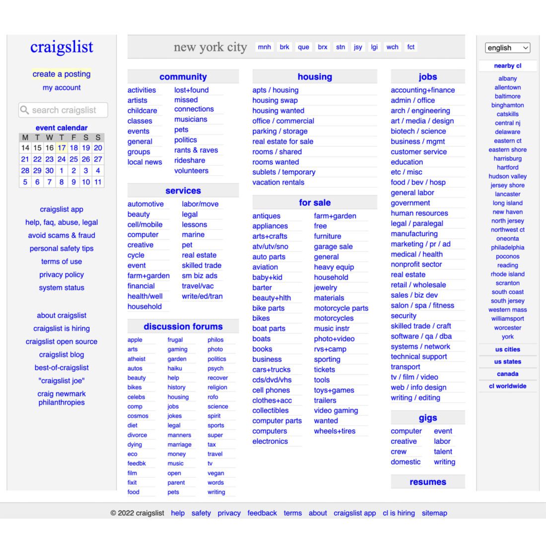
Craigslist is an excellent example of the design that inspires brutalist proponents today
Brutalist designers want to escape from the stale, cookie-cutter, premade-template-based websites that dominate the web today. They demand the web to be true to itself, to feel honest and not contrived. The brutalist philosophy shares the goals with the flat-design style, though it achieves this in very different ways.
Anti-design sites often feature a complete lack of visual hierarchy. Some use harsh colors, disorienting patterns, weird cursors, and unnecessary distracting animations. The overall effect feels like bad 1990s designs on steroids and the conference site for Bloomberg Businessweek Design 2016. Anti-design must be used with caution and only in a way it does not break the user interest. We think anti-design should be used only in contact (1) when the target audience is skilled or mature enough to be able to handle a more difficult UI. (2) Your product is meant for entertainment purposes only and discoverability is more important than findability. If your situation doesn’t match either of those contexts, an anti-design UI may backfire.
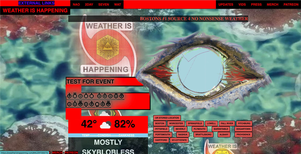
Anti-design – Weather Is Happening is an insane take on a weather website.
It is coming back in 2023, in its pure form, as well as Kitsch and Neo-brutalism. This style brings a wave of nostalgia to a time when people could break the rules of design and create quirky pages with system fonts, raw text, high contrasts, plain backgrounds, outlines, untouched images, etc. Everything looked different and dazzling, even wrong at first. However, that’s the power of brutalism. The style can help the website stand out among the others, with more standard and according-to-the-rules looks. People will notice and remember it for sure.
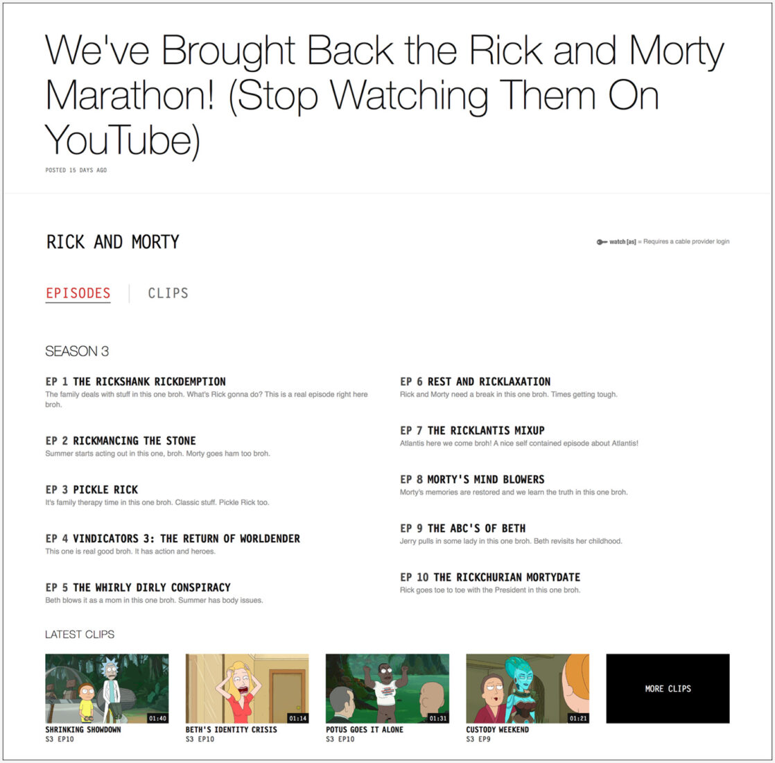
A brutalist style works great for adultswim.com. However, that the brutalist style is really only skin-deep. This site still has a clear visual hierarchy, and is fairly simple to navigate.
As for neo-brutalism, a style popularized by Figma and Gumroad has similar features. In comparison with standard styles, it combines pure black with other bright colors. The latter ones usually don’t work together and give a strange impression. The shadows are not blurred or softened and are sharp and plain as a marker sketch.
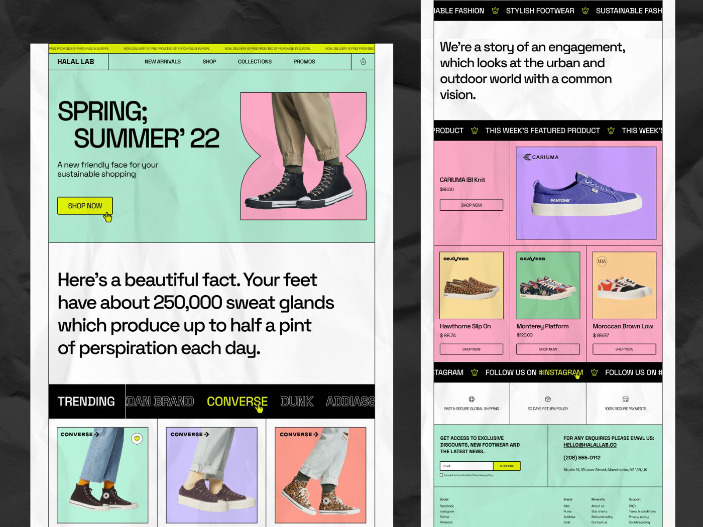
E-Commerce web layout exploration by Arman Chowdhury Nijum
To leverage the brutalist style, keep it limited to visual design. Don’t break your visual hierarchy, navigation, or interaction design just for the sake of novelty. And stick to pure brutalism, while avoiding anti-design like the plague it’ll be for your business metrics.
Web-accessibility
Creating an accessible website is all about providing every person who visits your website the ability to use your website. When it comes to meeting the standards set by the Americans with Disabilities Act (ADA) Standards for Accessible Design, there are multiple requirements to meet. Considering accessibility for web design also means considering over 1 billion people with disabilities to have access to your website. Accessibility prioritizes building a digital experience that is perceivable, operable, understandable, and robust. That’s why most companies invest in ADA compliance services or tools.
Website accessibility is best achieved when the following characteristics are considered while designing a website.
- Your web design is equitable and marketable to people with diverse abilities
- Your website design is flexible to attune a broad range of user abilities
- Your web design portrays easy understandability, regardless of user experiences
- Your site effectively communicates the necessary information irrespective of different user competencies
If you have a WordPress website, for example, there are several plugins available like Accessibility Suite and WP Accessibility Helper.
Whether you choose to partner with a service provider or use a tool, you want to get started as soon as possible. The longer your business waits to act on this web design trend, the longer your site remains unusable to people with disabilities.
Virtual and augmented reality
If you’re a web designer, you might already be hyperventilating about this section. Designing immersive worlds and AR experiences is outside the purview of most web designers, but that could be changing.
When done right, businesses can reap a ton of benefits by using AR and VR on their websites. For example:
- By creating more immersive and interactive content, engagement rates increase, which tends to boost conversion in parallel.
- VR & AR experiences are more memorable and can help a business stand out from the competition.
- Consumers that are empowered to virtually explore a product or an experience can make more confident buying decisions. This then reduces the returns, refunds, and dissatisfaction a company has to deal with.

Here by The University of Sydney
Companies like Meta are pushing immersion as the next frontier of the internet. While it may never be a one-size-fits-all solution, it has plenty of utilities for business. In this example, the University of Sydney offers an immersive 360º virtual tour of their campus, complete with audio.
Companies like Amazon offer “View in your Room” services via their mobile app in the USA where customers can see an item on Amazon in their room before making a purchase decision. Similarly, ray-ban is offering virtual try-on before you buy and thus reducing the returns.
What this means is that in 2023 web designers should make websites that can bring better user experience and higher engagement. With the rise of AR & VR and augmented reality, interaction with websites shouldn’t just be limited to typing. The whole UX should also involve other senses.
Interactive 3D elements
Designing with an interactive 3D element on the web creates user delight, and in turn engagement, through its inherent unexpectedness, stemming from the origins of a two-dimensional web.
In 2023, interactive 3D renderings will become even more commonplace, as web designers are increasingly delivering the IRL feeling of physical products to 2D screens. Designers are bringing dimensionality to everything from decorative site features and logos to e-comm product renderings to integral parts of a site’s UI, all to give pixels a tangible touch.
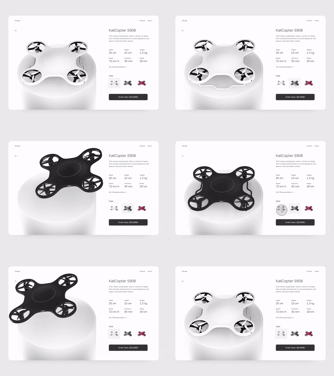
Quadcopter E-Commerce Store Animation Concept by Conceptzilla
The 3D design treatment will continue to grow in popularity, popping up across the web as yet another way to engage users who are spending a good portion of their waking hours online—and a wide range of industries are putting the design style to good use. For example, Lowe’s is currently offering virtual 360-degree views of its inventory. Gucci is another company using 3D elements to show off its high-end goods.
Artificial intelligence
Undoubtedly, artificial intelligence (AI) is reshaping the way websites are developed today. Many web design and development companies integrate AI skills to build intelligent web applications to boost the website’s scalability, interaction, viability, experience, and overall feel.
Artificial intelligence, or AI, is creeping its way into every area of marketing, even web design trends, and for good reason. In 2023, AI-based design methodologies will continue to grow as the increasing number of web designers adopt AI as a crucial part of web design and development. Artificial intelligence can now convert handwritten user interface design into self-updating HTML markup code (AI). The AI may take control of your website’s visual components, including fonts, animations, and other graphical information, and deliver a more personalized experience to the user.
When you implement AI on your website, you’re able to use data to satisfy customer needs. For example, many websites integrate chatbots that use artificial intelligence to reply. Not only do chatbots benefit companies since it allows them to focus their energy elsewhere, but it also helps customers that have questions by providing a reply immediately.
Minimalism
In our era of short attention spans and constant distractions, designers have to use techniques that allow communicating as succinctly as possible. This is where minimalism comes in handy.
Minimal web designs are purposefully devoid of extraneous features and gimmicks to communicate with the target audience straightforwardly and concisely. But before you adopt this style, it is important to understand what goals we hope to achieve with it. If you are building a minimal web design for the sake of trying out a new trend, then you have all of the wrong reasons. More than just another trend, minimalism transcends the medium of the internet or the computer and holds a place in art, architecture, and even philosophy.
Minimalism is the practice of putting forward only the most important message and removing unwanted distractions. Having an entirely minimal design will not always suit the needs of a design project. More often than not, you will find that minimalism will not be the right fit for the task at hand. Applying minimalism effectively to a more complex digital product can be challenging because it’s usually hard to achieve a balance when you have a lot of content and features. That’s why minimalism works best for projects that have fairly simple goals and relatively little content (like portfolio websites or promo pages, specialized products).
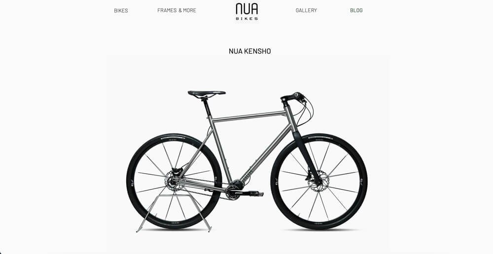
Nua Bikes website is deceptively minimalist
However, it is always important to underscore the principles of communicating information in a minimalistic nature. A minimalistic web design only shows elements of the highest importance and strips away everything that would distract users from what’s important, thereby ensuring high user engagement. Minimalism brought a few additional benefits to web design, such as:
- Good aesthetics. Well-designed minimalist products have a modern progressive look with effective use of typography, limited color schemes, negative space, and flat textures.
- Faster loading times. Minimalist websites and apps feature fewer objects, and thus, load faster.
- Better compatibility between screen sizes. No need to conduct a dramatic redesign to adapt a layout to different screen sizes.
In 2023, this style will continue to grow. By employing a minimalist approach to web design, designers will keep delivering websites as functional as appealing. This evergreen style is time-tested and delivers a site that looks cleaner and is easier for your audience to engage with your content and traverse them effortlessly.
Horizontal scrolling
Once considered a design mistake, horizontal scrolling is set to make things straight in 2023. Rather than replacing the conventional vertical scrolling, horizontal scrolling will be used where it can improve the user’s navigational experience.
Horizontal scrolling websites are an easy way to inject novel movement and visual breaks into your content—making them a particularly great choice for long-form articles. It will be of particular importance in designs with large volumes of visual content, for eg, portfolio websites, image galleries, and catalogs.
Horizontal scrolling opens up a variety of creative possibilities. It can be utilized for an entire website’s design, but can also be used in smaller touches to showcase images or other content you want people to pay attention to. Here, horizontal scrolling will provide a seamless user experience, optimally utilize the designs’ real estate and motivate users to explore the full length of the website without getting tired of scrolling.
Important aspects to consider in horizontal scrolling are:
- Give a clear visual indication of where horizontal scrolling is implemented
- Use them only where it can contribute positively to user experience
- Provide alternate ways of navigation
Companies like SomeFolk and Chaletbau Matti mix up vertically scrolled content with horizontal scrolling sections making us focus on their work, instead of quickly scrolling past it. Using horizontal scrolling to showcase blocks of related content, like featured projects, is an effective way to make sure that people don’t miss it.
Voice optimization
People are increasingly using voice search to find information on the internet. According to an estimate, by the end of 2022, voice shopping alone is set to become a $40 billion industry.
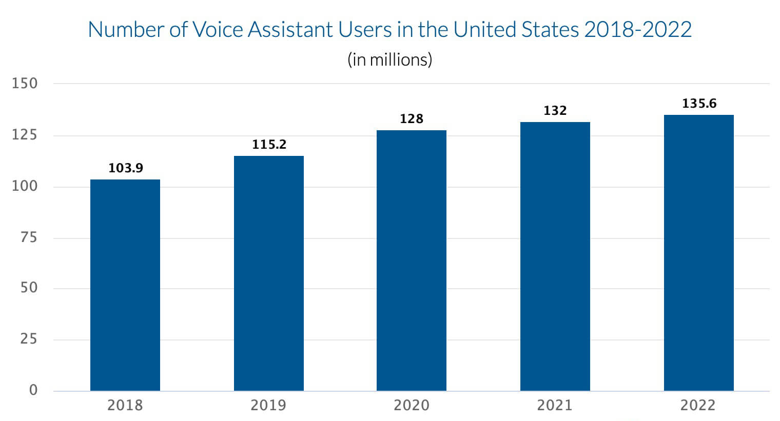
Source: eMarketer 2020
Today, more companies optimize their websites for voice searches, and the future of web design in 2023 is no different. This trend is only going to continue, so it’s important to optimize your website for voice search.
With more users relying on voice technology like Siri and Alexa to find what they’re looking for online, your website must use natural language processing (NLP) to appeal to every audience — including those searching by voice.
How do I integrate voice optimization into my website?
Follow the SEO best practices and ensure the following:
- Voice search queries have question words. Hence, use question keywords and long tail keywords
- Use Schema Markup to improve the relevance of your content
- Having an FAQ section would provide an immediate and short description as the answer to their question
- Create detailed and informative content with your customer persona in mind
- Ensure that your website loads fast
- Your website has to be mobile friendly
- Optimize your website with local SEO techniques to rank for “Near Me” voice queries
Page Speed
Page speed is one matrix that won’t stop appearing on any top web design trend lists. Today online users are impatient and want a fast and smooth user experience. 83% of internet users expect sites to load in three seconds or less. Search engines like Google use page speed as a ranking factor. Adopting page speed as a ranking factor allows search engines to improve the user experience. They’re not only providing users with the information and answers they want but with the experience they expect. That’s why faster websites tend to perform better in not only search results but also in sales and revenue.
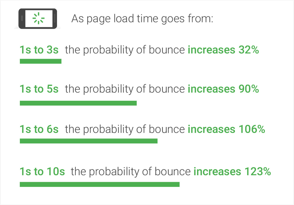
Source Google
Website design can make a huge difference in the speed of your website. By carefully choosing the type of content and layout, you can ensure that your site loads quickly and provides an enjoyable browsing experience for your visitors. In addition to optimizing your website’s layout, you should also consider optimizing your CSS and JavaScript code. By doing these three things, you will help to keep your website running as smoothly as possible and improve page speed dramatically.
WeCT can help your business turn your website into a speed demon, providing users with a fast and seamless experience across mobile and desktop devices. With a faster website, your company can earn higher rankings in search results, as well as more traffic, leads, and sales for growing your business. Get started by contacting us online today!
Mobile first design
Mobile browsing is becoming more prominent than desktop browsing. You’ll want to ensure that your web design is mobile-friendly. One big emphasis this coming year is making your site thumb-friendly.
Although the UI/UX design trend suggests focusing on cross-platform development, it should essentially start from the mobile version, based on the fact that in 2022, approximately 62% of website traffic will be from mobiles. Therefore, designers should now consider creating web designs for mobile phones first and then rebuild them with the same toolkit for other large-screen platforms like desktops or tablets.
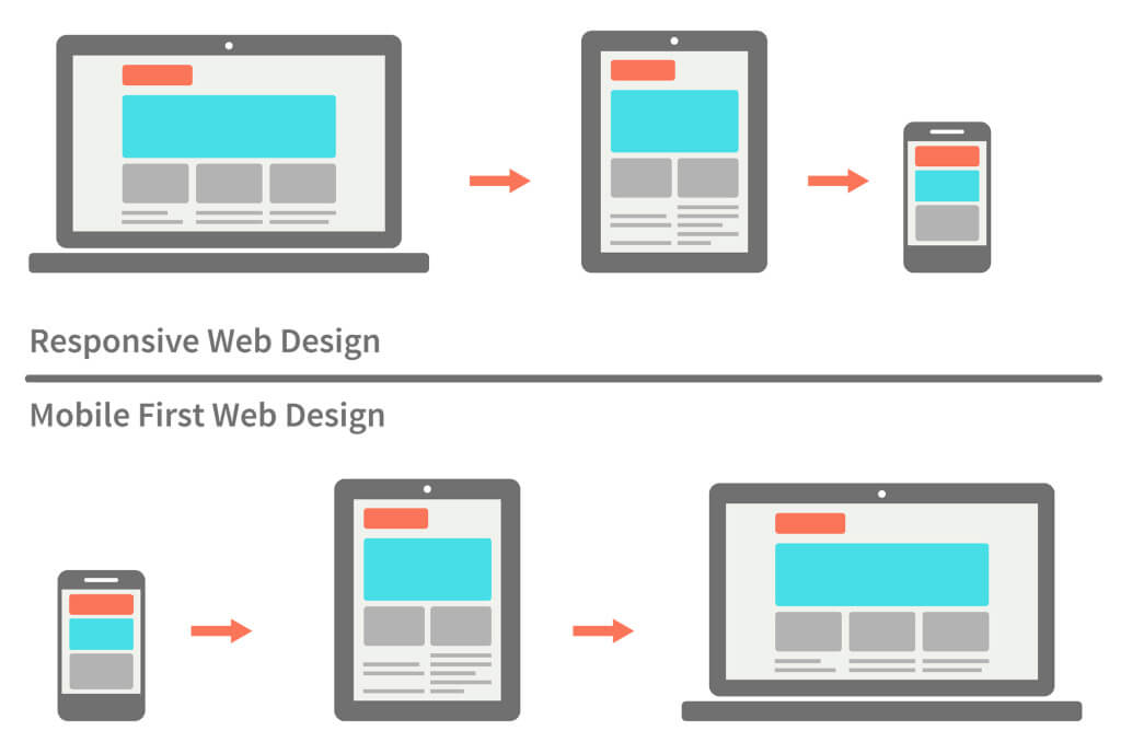
Mobile First Web Design Vs Responsive Web Design
This approach requires adopting responsive web design practices with a certain scale potential on various screen resolutions and devices configuration. For sure, the ones that are cost and time effective. Also, the designer should be aware of the situation when the device is used. Ambient noises or light absence influence the experience greatly. This is called a context-first design, and the practice will become more popular in the future.
Freaked out?
Knowing the latest web design trends is just half of the work. The real challenge is to implement them correctly into your website. Moreover, it is better to pick only those trends that align to your current business and branding strategy. WeCT Interactive can help update your existing website or create a fresh new website that guarantees success heading into the new year.
No matter what you need to prepare for 2023 web design trends, WeCT is here to help! Check out our affordable website packages or contact us online or give us a call at 201-201-9129 today! Need advice on a website redesign? Need a complete website overhaul? We can help with that, too!
Recommended for you
Re-imagining businesses through experiences
We are a full-service digital agency with leading capabilities across digital – from web design to development, branding to marketing, cloud transformation to security. We create human-centered and future proof experiences – enabling transformation, ensuring sustainable growth.
